


The elements and principles of design are the building blocks used to create a work of art. The elements of design are the things that make up a painting, drawing, design etc. Good or bad - all paintings will contain most of or even all the seven elements of design. How we apply the principles of design determines how successful we are in creating a work of art.
The elements of design are line, shape, direction, size, texture, coloor, and value.
Lines are used to divide space, direct the eye, and create forms. At the most basic level, straight lines are found in layouts to separate content, such as in magazine, newspaper, and website designs. This can, of course, go much further with curved, dotted, and zigzag lines used as the defining elements on a page and as the basis for illustrations and graphics.
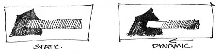
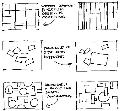
A shape is a self contained defined area of geometric or organic form. A positive shape in a painting automatically creates a negative shape. They are used to establish layouts, create patterns, and build countless elements on the page. All lines have direction – horizontal, vertical or oblique. Horizontal direction suggests calmness, stability and tranquillity. Vertical gives a feeling of balance, formality and alertness, where as oblique suggests movement and action.
Size is simply the relationship of the area occupied by one shape to that of another.
Texture is the surface quality of a shape - rough, smooth, soft hard glossy etc. Texture can be physical (tactile) or visual.
Colour is an interesting element of graphic design because it can be applied to any other element, changing it dramatically. Graphic designers should combine their experience with colour with an understanding of colour theory.
Value is the lightness or darkness of a colour. Value is also called tone.
There are several principles of design, which include balance, gradation, repetition, contrast, harmony, dominance, and unity.
Balance in design is similar to balance in physics.

A large shape close to the centre can be balanced by a small shape close to the edge. A large light toned shape will be balanced by a small dark toned shape (the darker the shape the heavier it appears to be).
Gradation of size and direction produces linear perspective. Gradation of colour from warm to cool and tone from dark to light produce aerial perspective. Gradation can add interest and movement to a shape. A gradation from dark to light will cause the eye to move along a shape.
Repetition with variation is interesting, without variation repetition can become monotonous.
Contrast is the juxtaposition of opposing elements, for example opposite colours on the colour wheel - red / green, blue / orange etc. Contrast in tone or value - light / dark. Contrast in direction - horizontal / vertical.
The major contrast in a painting should be located at the centre of interest. Too much contrast scattered throughout a painting can destroy unity and make a work difficult to look at.
Harmony in painting is the visually satisfying effect of combining similar, related elements, for example, adjacent colours on the colour wheel, similar shapes etc.
Dominance gives a painting interest, counteracting confusion and monotony. Dominance can be applied to one or more of the elements to give emphasis.
Unity in a painting also refers to the visual linking of various elements of the work. For example a painting with an active aggressive subject would work better with a dominant oblique direction, course, rough texture, angular lines etc. whereas a quiet passive subject would benefit from horizontal lines, soft texture and less tonal contrast.
III Answer the questions:
1. What are the elements of design?
2. What principles of design do you know?
3. How is surface quality of a shape called?
4. What does gradation of size and direction produce?
5. Why is colour an interesting element of graphic design?
6. What is the purpose of dominance?
7. Where should the major contrast in a painting be located?
8. How is juxtaposition of opposing elements called?
9. What kind of repetition is interesting?
10. What produces linear perspective?
IV Complete the sentences with the words from the text:
1. … are line, shape, direction, size, texture, color, and value.
2. All … have direction – horizontal, vertical or oblique.
3. Texture is the surface … of a shape - rough, smooth, soft hard glossy etc.
4. Too much … scattered throughout a painting can destroy unity and make a work difficult to look at.
5. … in painting is the visually satisfying effect of combining similar, related elements.
V Find the English equivalents to the words:
розташування, створювати, застосовувати, форма, косий, рух, лінійна перспектива, протилежний елемент, головний контраст, якість поверхні
VI Make up the sentences with the terms:
elements of design, shape, size, colour, repetition, unity, dominance
VII Give definitions to the words:
line, direction, texture, balance, gradation, contrast, harmony
VIII Translate sentences into English:
1. Елементи та принципи дизайну використовуються для створення витворів мистецтва.
2. Кожний малюнок містить в собі більшість або навіть усі елементи дизайну.
3. Лінії ділять простір, направляють око та створюють форми.
4. Горизонтальні лінії дають відчуття спокою та стабільності.
5. Колір може бути застосований до будь-якого іншого елементу.
6. Занадто багато контрасту може знищити єдність.
7. Єдність – це візуальне поєднання різних елементів малюнка.
8. Велика форма у центрі може бути збалансована маленькою формою біля краю.
IX Speak on the topic using the following words and word-combinations:
elements and principles of design, creating a work of art, line, shape, direction, size, texture, colour, value, balance, gradation, repetition, contrast, harmony, dominance, unity.
Text B
I Read and remember:
1. unquestioning faith – безсумнівна віра
2. immortal – безсмертний
3. sheath – футляр
4. outrageously – образливо
5. supple – гнучкий
6. furthermore – крім того, більше того
7. magnificent – блискучий
8. hemline – підігнутий край виробу
9. beneath – нижче, під
10. suspenders – підтяжки
II Read the text and define the main idea:
Paul Poiret:
The first designer
“Fashion needs a tyrant,” proclaimed Paul Poiret, and with that he identified exactly what was needed in fashion at the turn of the century. From an early age he knew that he was destined for greater things. Anyone with too much imagination and not enough discipline for a normal day’s work must be a born artist.
It is extraordinary that to this day Poiret is celebrated as the fashion liberator of women, since he was interested only in his own glory and the only standard he accepted was his own taste.
Fortunately there were women who had an unquestioning faith in him.
Poiret might rightly have claimed that “I’ve gone to war against the corset,” but his revolutionary deeds had purely aesthetic motives.
Poiret designed a simple, narrow robe with a long skirt that began below the bust and fell sheathlike to the floor in a straight line. With this he created a design that made him immortal.
Compared with the laced, dressed-up beauties of the belle époque, the new Poiret women looked modest, young, and outrageously supple. Hidden beneath her light dress was quite obviously a good figure instead of a good corset.
Having considered himself the liberator of women, he could not understand that the war had done more for women’s independence than fashion could ever do. He still believed that women were waiting for the master to force them into his amazing designs. His hobble skirt, the jupe entravée, did not catch on.
That did not much bother the fashion dictator. For a long time he had seen himself as the sultan who dresses his harem in the most magnificent Oriental designs. He forced his slaves to wear caftans, kimonos, pantaloons, tunics, veils, and turbans. At last there was pure luxury again: colourful embroidery, lace interwoven with gold and silver, splendid brocades, fringed borders, pearls, and rare feathers.
He became the first couturier to develop his own perfume, ten years before Chanel. Artistic designs were printed straight onto the finest silk. This represented a revolution in the textile industry, which up until then had been capable of printing only the simplest patterns on the cheapest fabrics.
Poiret could no longer be called simply a couturier. He became the first real designer of the 20th century, who left his aesthetic mark on everything around him and on everything he could sell, from accessories to interior design. He wrote in his autobiography, “but I saw her hidden beauty.” To make women look younger and more daring, Poiret not only replaced the corset with elastic bras and light suspenders; he also used strong colours and bold patterns instead of washed out pastel shades and festoons. Furthermore, he rejected black stockings and gave women – and men – the illusion of bare legs by wrapping them in skin-coloured silk.
Poiret constantly raised the waistline and with it the bust; the décolletage got lower and the skirts tighter. In 1910 he invented the hobble skirt, which tapered to such a tight hemline that it forced its wearer to take the tiny steps of a geisha. Poiret found this very amusing: “I have liberated their upper body, but I’m tying their feet.” But he was wrong. This time women did not follow him.

