If a researcher plans to present a report, he is required to know the conference guidelines including the floor language, established time limit, cultures and corporate rules concerning the presentation technology. At present, English language presentations are commonly used in international scientific conferences, so a working knowledge of the English vocabulary is a valuable asset for presenters as well as efficient presentation techniques.Read the text using the word list below and answer the following questions:
1. Have you ever delivered a presentation in English?
2. What was your presentation about?
3. Was your presentation actually successful?
4. Can you answer the audience's questions knowledgeably and confidently?
5. How can your audience know the structure of your presentation?
6. How can your listeners know where they are?
7. How can your audience know what is coming next?
8. How could you know that the audience had liked your presentation?
“A picture is worth one thousand words”
International Scientific Conferences are held to provide an opportunity for scientists from a variety of countries to present their work, to become more involved in science activities and to draw attention to various challenges in different fields of knowledge.
Personal participation in conferences implies live talks and presentations that are considered the most useful and extremely effective means of communication. A successful presentation is a very impressive way of showing and explaining the main issues of the performed research to an audience. As the vast majority of all the information enters our brains through the eyes, it is necessary to create good visual aids and handouts. They will be very useful for non-native English speakers who can rely on them and need not worry about their poor English because an audience learns aurally only 20% of presented information, the rest is absorbed visually.
Presenters design visuals or create slides for clear supporting their live talk. Visuals and slides are not the same thing. In fact, visuals are very convincing documents including pictures, pieces of film, or displays used to illustrate the presented ideas. Projected slides are also rather effective tools to accompany scientific reports. They should be as visual as possible and quickly, efficiently and powerfully support each presented point. During presentations, images can be projected from the notebook computer screen onto the wall screen by an overhead projector.
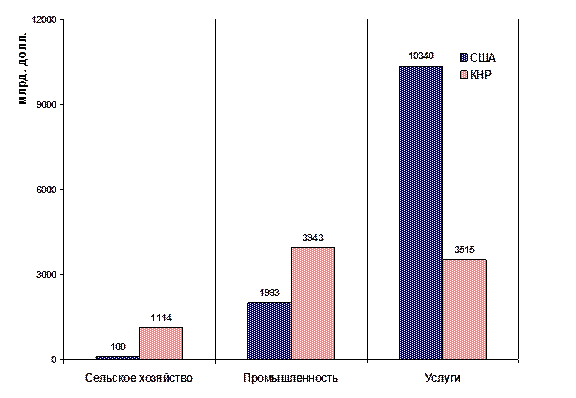
Presenters use projected slides to demonstrate the multi-coloured 3-dimensional charts and graphs – pie charts that are circular in shape, bar charts that can be either vertical or horizontal, and graphs that can rise and fall. Besides slide shows display synopses of the author’s main ideas. A presenter does not simply give commentary to the slides but tells his thoughts and suggestions in details.
Slide design should not draw audience’s attention away from the content of the presented information, as it is aimed to readability and not to florid embellishment. In doing so, the author should not go from one extreme to another, and write black letters against a white backdrop. The whole slide show should be designed in the same simple, plain and laconic perceptual style. Usually presenters submit their slides made in "PowerPoint " programme because the information arranged by this software can be easily displayed or downloaded from the conference website. In case of including PowerPoint slides in future conference proceedings, they must be produced as PDFs. Therefore, it is better to make two sets of slides -one set of simple, clear slides for the live performance and another one for the conference proceedings or webpage download.
Embedded animated graphics is not widely acceptable and is usually used only for drawing audience’s attention, for instance, to successive appearance of diagram elements.
Slides must be enumerated and show their quantity. Each slide must be entitled and contain only one idea written in short words and clear short sentences against a coloured backdrop used for highlighting overprinted text. The choice for colours must be restricted by two or three tints. The ideal combination is dark letters and a faint even backdrop that contributes to the visual effect of displayed graphics. The most appropriate font is as large as 18 pts. Serif fonts are much more readable than nonserif ones. If font contrast is necessary it may be achieved by differences in font size, shape, colour, etc.
Each slide may offer not more than 17 words or three illustrations including written explanation. The author can include written details in the notes view of each slide. The tables with good many figures or other facts are not desirable.
Handouts or so-called “takeaway documents” are completely different from visuals and slides with more detailed information and a summary of presented issues. These pieces of printed information are provided free of charge and distributed to an audience because people might be interested in much depth, background and scope in presented information that could be read much faster than a presenter can tell his ideas.
Modern presentation has resulted in using computer-aided presentation technology that observes some rules.
The first rule demands that reporting time should not be more than 12 minutes, which are followed by a three-minute’s discussion.
The second rule states the common slide sequence. It allows ten or eleven slidesto support a reporter’s live talk. Usually presentations start with a front slide that displays the University name (at the top of the page), the title of the subject, the reporter’s name (in the centre of the page), the city and the year (at the bottom of the page). This slide is followed by the presentation plan (not more than 5-6 items). Then one after another, come three introduction slides, which take up approximately ⅓ of the report content.The next slide is devoted to methods. It is followed by three or four slides with basic content and results. The conclusion slide demonstrates findings or summary and prospects. The final “thanks” slide expressing gratitude to audience may contain the author’s signature.
The third rule restricts information content.It is advisable to state only one or two objectives. In general, slides must present concrete facts rather than abstract ideas. Key issues must be carefully selected and clearly described because visual information is more important than a spoken message. Besides, the information on each slide should be kept to a minimum because it might be unknown to the audience, and people cannot instantly absorb many new ideas. People might need some time to study and understand the originality of presented information.
The fourth rule makes a presenter to think carefully over the structure of his presentation before talking to an audience. He may use 'signposting' (or 'signaling'), that is a special technique of putting up signposts for an audience at the beginning and all over the report so that people can know what is coming next. A presenter might write down some indications or show the slide with a presentation plan including the content of introduction, body and conclusion, so that each person could visualize it. Then he might say a few words like this: "I will start by exploring the importance of …. I'll start by describing the …. After that, I will consider …. Then I'll move on to some of the achievements we've made …. Then we will look at …. After that I'll consider the opportunities we see for further expansion in …. After delivery, we will examine …. Before moving on to …. Finally, we will conclude with …. Lastly, I'll quickly recap before concluding with some recommendations." Afterwards, you will be invited to ….
A presenter should keep to his signposts throughout the presentation. It will help him and his audience to know which issue he has revealed and what point is to be reached next. Moving from one point to the next one a presenter might say: "That's all I have to say about …. Let's turn now to …." Having finished the main part of his report and summing it up a presenter might say: "Well, we've looked at …. I'd like to sum up now." Then he gives his recommendations using the words like this: "What does all this mean for us? Well, firstly I recommend..." or some other phrases and expressions that could signpost the various parts of a presentation.
Having created his slide show and its formatting a presenter checks it carefully to make sure that everything is in full working order, every detail is explained and the information that was so hard to obtain looks as professional as possible. The next step is to rehearse the presentation two or three times before its public performance.
Table 14 Word List
| № | Words and word combinations | Translation |
| 1. | backdrop | фон, основной цвет под изображение |
| 2. | bar chart | столбчатая диаграмма |
| 3. | body | основная часть доклада, конференции |
| 4. | computer-aided presentation technology | электронная презентация |
| 5. | conference guidelines | требования конференции |
| 6. | create slides | создавать слайды |
| 7. | design visuals (visual aids) | создавать визуальные средства |
| 8. | draw audience’s attention | привлекать внимание слушателей |
| 9. | embedded animated graphics | встроенная в слайд анимация |
| 10. | final “thanks” slide | заключительный слайд |
| 11. | front slide | первый слайд презентации |
| 12. | graph | график, диаграмма, схема; кривая |
| 13. | handouts | раздаточный материал |
| 14. | hold a conference | проводить конференцию |
| 15. | key issues | главная проблема |
| 16. | obtain information | получать информацию |
| 17. | pie chart | круговая, секторная диаграмма |
| 18. | present a report | делать презентацию доклада |
| 19. | scientific activities | научная деятельность |
| 20. | serif fonts | шрифт с засечками |
| 21. | set of slides | набор, комплект слайдов |
| 22. | signposting | обозначать разделы доклада |
| 23. | support live talk | сопровождать звучащую речь |
| 24. | synopsis | краткий обзор, тезисы; краткое содержание, аннотация, реферат |
| 25. | time-limit | ограничение времени выступления |
Exercise 5.2.1


