


Choropleth
Shaded or choropleth1 maps show differences in data area by area, they are good for making comparisons between places (see Figure 2). An example might be county maps showing levels of unemployment or areas of high ground.
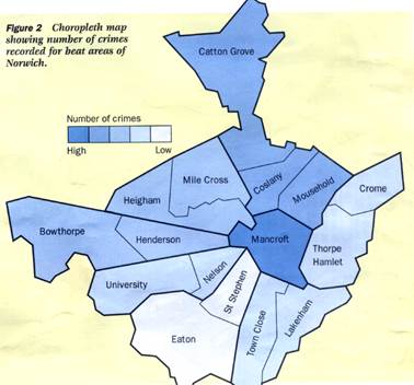 |
To make your own choropleth map, you will first have to divide your data into equal categories (up to a maximum of about five intervals). Then make a key on your base map and decide on your shading colour. It is important to use just one colour in shades from light to dark. Use the darkest shade of colour to indicate the highest numbers and vice versa.
Topological maps
A topological map2 is one where distances between places have been altered and routes simplified, but the position of one place relative to another is still recognisable (see Figure 3). The London Underground map is a good example. Topological maps can also represent travel time (actual or perceived) rather than distances. They are useful when considering the accessibility of certain places or areas.

Fig. 3. Topological map showing access time to five destinations. This can he based on actual or perceived travel time.
Proportional flow maps
On proportional flow maps3, the width of lines is proportional to the volume or size of movement between places (see Figure 4). They are particularly useful for displaying the results of traffic flows, but can be used to indicate any movement across a space.

Fig. 4. Proportional flow map for traffic volumes in a town center
Dot maps
Dot maps4 show the distribution of items such as people, houses or plants (see Figure 5). The pattern of dots may also be analysed statistically, e.g. by nearest neighbour analysis. When constructing dot maps consider the dot size Ц this can be used to generate a hierarchy based on the relative sizes of populations.
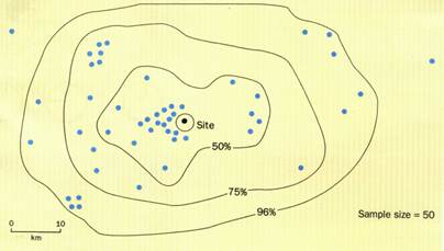
Fig. 5. Dot distribution map (including isolines). This example shows the sphere of influence of visitors to a honeypot site, based on questionnaire data.
Graphs
Unlike most maps, graphs can be produced using computer software such as Excel or Lotus. Using graphs can also demonstrate your skills. You need to be very careful in selecting the most appropriate type of graph from the computer menu, not always the first one that appears on the drop-down list. Avoid some of the more showy three-dimensional graph types which can be complex for the reader to interpret.
Line graphs
Line graphs5 are used when measurements are continuous, e.g. traffic, employment or river discharge (see Figure 6). They show the relationship between two variables, one of which causes the other to change, e.g. temperature and altitude. Altitude causes the temperature to change so it is the independent variable (x-axis), with temperature on the y-axis (dependent variable). If you have very large ranges on one single graph, e.g. 2-10,000 then consider using log or semi-log paper.

Fig. 6. Line graph showing changes in wind speed over 12 hours in three locations. Multiple data sets are displayed on the same axis which has been reseated to accommodate all data.
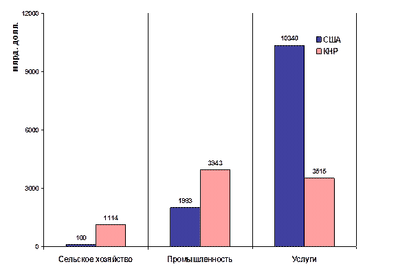
Bar graphs
In this type of bar graphs6 the horizontal x-axis represents a number of separate categories and the vertical axis shows the values or frequency (see Figure 7). Often a gap is left between bars (note that the computer won't do this automatically).


