


 The creation of manuscripts led to high points in graphic design, but it was with the development of printmaking technologies that the art and practice of graphic design truly blossomed. Their antecedents occurred in China, where the use of woodblock, or relief, printing, was developed perhaps as early as the 6th century AD. This process, which was accomplished by applying ink to a raised carved surface, allowed multiple copies of texts and images to be made quickly and economically. The Chinese also developed paper made from organic fibres by AD 105. This paper provided an economical surface for writing or printing; other substrates, such as parchment and papyrus, were much more costly to prepare than paper.
Surviving artifacts show that the Chinese developed a wide range of uses for printing and that they achieved a high level of artistry in graphic design and printing from an early date. Artisans cut calligraphic symbols into woodblocks and printed them beautifully; printed sheets of paper bearing illustrations and religious texts were then pasted together to make printed scrolls. By the 9th or 10th century, paged woodblock books replaced scrolls, and literary, historical, and herbal works were published. Paper money and playing cards were also designed, their designs cut into woodblocks and printed.

 Chinese alchemist Bi Sheng invented a movable-type printing technique about AD 1040s; however, this technology did not replace the hand-cut woodblock in Asia, in part because manipulating the thousands of tablets with characters used in calligraphic languages required an enormous amount of labour.
Chinese inventions slowly spread across the Middle East and into Europe. By the 15th century, woodblock broadsides and books printed on paper were being made in Europe. By 1450 Johannes Gutenberg of Mainz (Germany) had invented a method for printing text from alphabet characters cast on movable metal types. After this, printed books began to replace costly handmade manuscript books. Designers of early typographic books in Europe attempted to replicate manuscripts. While setting the type, spaces were left for illuminators to add pictures, ornate initials and other decorative material by hand. In this way, the compositor or typesetter was in effect the designer. Some surviving copies of Gutenberg's landmark 42-line Bible have headers, initials, and sentence markers applied by hand in red and blue inks.
By the mid-15th century, printers combined woodblock illustrations with typeset text to create easily produced illustrated printed books. They printed woodblock decorative borders and ornamental initials along with the type, subsequently having colour applied by hand to these printed elements.
The prevalence of movable type and increasingly advanced printing technology in Europe meant that, of all other cultures, major advances in graphic design over the next several centuries would mainly be centred in Europe.
Illustrations: 1. A Ming Dynasty (1368 - 1644) woodblock print which includes descriptions and eight-line poems about the city of Nanjing (or "Jinling") and surrounding region written by Zhu Zhifan, with drawings by Lu Shoubo, 1624, 2. Movable-type printing in China, 3. A detail of the GutenbergBible, printed by JohannesGutenberg. 1445.
|
|
|
VOCABULARY NOTES
VERBS & COMBINATIONS WITH VERBS
1. to blossom ['blɒsəm] Ц процветать
syn. to bloom, to flourish, to thrive
N.B. Mind the possibility of two different prepositions following one verb in English making the meaning of the verb slightly modified which requires using two verbs in the Russian translation:
2. to spread across (some territory) and into (some other territory as well) ['spred ə'krɒs] Ц распространитьс€ по (какой-л территории), а также попасть (ещЄ на какую-л территорию)
COMBINATIONS WITH ADJECTIVES
3. literary work ['lɪt(ə)rərɪ 'wз:k] Ц литературное произведение
4. historical work [hɪ'stɒrɪk(ə)l 'wз:k] Ц работа по истории
5. herbal work ['hз:b(ə)l 'wз:k] Ц книга-травник (с описанием лекарственных растений)
NOUNS
6. amount of smth [ə'maunt] Ц количество (чего-л)
syn. quantity
to require an enormous amount of labour Ц быть трудоЄмким (о работе)
syn. v.s. UNIT III: time-consuming (production)
7. antecedent [ˌæntɪ'si:dənt] Ц предшественник, предпосылка (чего-л)
syn. ancestor, ascendant, foregoer, forerunner, harbinger, predecessor, prototype
8. landmark ['lændmɑ:k] Ц веха, поворотный пункт (в истории, и т.п.)
Gutenberg's landmark 42-line Bible Ц новаторска€ У42-строчна€ Ѕибли€Ф √утенберга
9. point (in some activity) [pɔɪnt] Ц уровень, стандарт (в какой-л де€тельности)
syn. level
10. range of smth [reɪndʒ] Ц диапазон, предел (чего-л)
ADVERBS
11. mainly ['meɪnlɪ] Ц главным образом
syn. by and large, chiefly, largely, mostly, on the whole, predominantly
12. subsequently ['sʌbsɪkwəntlɪ] Ц впоследствии, позднее, позже, после, потом
syn. afterwards, later (on)
13. truly ['tru:lɪ] - действительно, по-насто€щему; в полном смысле слова
SET PHRASES
14. in effect [ɪn ɪ'fekt]Ц фактически
15. in this way [ɪn 'ðɪs 'weɪ]Ц таким образом
16. of all other Е [əv 'ɔ:l 'ʌðə]Ц из всех других Е (= (Ќе Е, а именно Е)
e.g.: Of all other cultures, major advances in graphic design were centred in Europe. »менно в ≈вропе сосредоточились основные линии развити€ графического дизайна.
PROFESSIONAL TERMS
17. apply (ink to a surface) [ə'plaɪ] Ц наносить (чернила на поверхность)
18. artisan [ˌɑ:tɪ'zæn] Ц ремесленник, мастеровой
19. (decorative) border ['bɔ:də] Ц (декоративна€) кайма, окантовка (страницы)
20. broadside ['brɔ:dsaɪd] Ц большой лист бумаги с печатным текстом на одной стороне
syn. broadsheet
21. to carve [kɑ:v] Ц вырезать, резать (по дереву, кости); гравировать
22. to cast [kɑ:st] Ц отливать, лить (металл)
syn. to mould, to found
23. fibre ['faɪbə] Ц волокно, нить
24. header ['hedə] Ц заголовок
syn. heading, title, (газетный) headline
25. movable-type printing ['mu:vb(ə)lˌtaɪp 'prɪntɪŋ] Ц печать с использованием съЄмного наборного шрифта
|
|
|
26. ornate (initial) [ɔ:'neɪt (ɪ'nɪ∫(ə)l)] Ц изысканно украшенный, витиеватый (о заглавной букве, и т.п.)
syn. ornamental Ц орнаментальный, декоративный, служащий украшением
27. to paste smth together ['peɪst tə'geðə] Ц склеивать что-л вместе
28. a raised carved surface ['reɪzd 'kɑ:vd 'sз:fɪs] Ц рельефна€ (выпукла€) резна€ поверхность (печатной таблички)
29. relief printing [rɪ'li:f 'prɪntɪŋ] Ц высока€ печать (способ печати, использующий формы, на которых печатающие элементы расположены выше пробельных. раска наноситс€ на поверхность выступающих печатных элементов. ѕри соприкосновении с бумагой, дл€ полного перехода краски, необходимо давление пресса.)
30. to replicate ['replɪkeɪt] Ц делать копию, копировать (какое-л изделие, произведение искусства)
syn. to copy, to reproduce
31. a tablet with a character ['tæblɪt wɪð ə 'kærɪktə] Ц табличка (дощечка) с печатным знаком (литерой, цифрой)
32. type [taɪp] Ц печатна€ матрица, шрифт
33. woodblock printing ['wʊdblɒk 'prɪntɪŋ] Ц ксилографическа€ печать (греч., от xylon Ц дерево, и grapho Ц пишу). »скусство печатани€ дерев€нными резными досками; китайский способ печатани€.
syn. v.i. UNIT VI: woodcut printing
CULTUROLOGICAL & HISTORICAL TERMS
34. Johannes Gutenberg [dʒəʊ'hæni:s 'gu:tənˌbз:g] Ц »оганн √уттенберг (1397 или 1400 Ц 1468) Ц немецкий ювелир и изобретатель. —оздал европейский способ книгопечатани€ подвижными литерами.
CONSTRUCTIONS
N.B.: Mind the structure and ways of translation of
35. Ц Уcleft sentencesФ, e.g.: It was John who helped me.
A cleft sentence is one where a simple sentence has been split (or СcleftТ) into two clauses, thus bringing different clause elements into focus. The stress is laid on the final element of the clause introduced by УitФ, while the subsequent clause, introduced by УwhatФ, УwhoФ, УwhenФ, etc. (Уwh-cojunctivesФ) or the universally used УthatФ, repeats given, previously known and thus less important information:
It was with the development of printmaking technologies that the art and practice of graphic design truly blossomed.
»менно (“олько) с развитием печатного дела искусство и практика графического дизайна расцвели по-насто€щему.
36. Ц The (Prepositional) Nominative Absolute Participial Constructions:
(With) n (Common case) / pron (Nominative case) + Participle I or II,
the Subject + the Predicate.
The (Prepositional)Nominative Absolute Participial Constructions are used in the function of adverbial modifiers of time, cause or attendant circumstances, e.g.:
Paper money and playing cards were also designed, their designs cut into woodblocks and printed.
“акже создавались банкноты и игральные карты, причЄм их образы вырезались на дерев€нных болванках и затем печатались. (¬ приведЄнном предложении рассматриваема€ конструкци€ выполн€ет функцию подлежащего и сказуемого придаточного предложени€ сопутствующего обсто€тельства (The Clause of Attendant Circumstances)).
37. Ц Уfor-phraseФ (for + n (Common case) / pron (Objective case) + infinitive):
Spaces were left for illuminators to add pictures. Ц —вободные места оставл€ли дл€ того, чтобы иллюстраторы могли вставить туда рисунки.
38. Ц have smth done:
= У–аспор€дитьс€, (попросить, сделать так) чтобы кто-л сделал что-лФ
Printers printed decorative borders and ornamental initials along with the type, subsequently having colour applied by hand to these printed elements.
Ц ћастера печатали вмести со шрифтом декоративные обрамлени€ витиеватые заглавные буквы, а затем на эти графические элементы вручную наносилась краска.
(“о есть, мастера-печатники последний этап работы выполн€ли не сами, а перепоручали его специалистам в этой области - художникам.)
|
|
|
UNIT VI
RENAISSANCE BOOK DESIGN
 The Renaissance saw a revival, or Уrebirth,Ф of Classical learning from ancient Greece and Rome throughout Europe. Beginning from the late 15th century, printing played a major role in this process by making knowledge from the ancient world available to all readers. Typeface designs evolved toward what are now called Old Style types, which were inspired by capital letters found in ancient Roman inscriptions and by lowercase letters found in manuscript writing from the Carolingian period.
The Italian scholar and printer Aldus Manutius the Elder founded his Aldine Press in 1495 to produce printed editions of many Greek and Latin classics. His innovations included inexpensive, pocket-sized editions of books with cloth covers. About 1500 Manutius introduced the first italic typeface, cast from punches cut by type designer Francesco Griffo. Because more of these narrow letters that slanted to the right could be fit on a page, the new pocket-sized books came to be set in fewer pages.
The prototype for Renaissance book design was the Aldine Press's 1499 Hypnerotomachia Poliphili, believed to be written by Francesco Colonna. The design of the work achieves an understated simplicity and tonal harmony, and its elegant synthesis of type and image has seldom been equaled. The layout combined exquisitely light woodcuts by an anonymous illustrator with roman types by Griffo utilizing new, smaller capitals. Griffo cut these types after careful study of Roman inscriptions. Importantly, double-page spreads were conceived in the book as unified designs, rather than as two separate pages.
 During the 16th century, France became a centre for fine typography and book design. Geoffroy Tory Ц whose considerable talents included design, engraving, and illustration, in addition to his work as a scholar and author Ц created books with types, ornaments, and illustrations that achieved the seemingly contradictory qualities of delicacy and complexity. In his Book of Hours (1531), he framed columns of roman type with modular borders; these exuberant forms were a perfect complement to his illustrations.
Typeface designer and punch-cutter Claude Garamond, one of Tory's pupils, achieved refinement and consistency in his Old Style fonts. Printers commissioned types from him rather than casting their own, making Garamond  the first independent typefounder not directly associated with a printing firm. Works by Tory, Garamond, and many other graphic artists and printers created a standard of excellence in graphic design that spread beyond France.
 The 17th century was a quiet time for graphic design. Apparently the stock of typeface designs, woodblock illustrations, and ornaments produced during the 16th century satisfied the needs of most printers, and additional innovation seemed unnecessary.
Illustrations: 1. Two-page spread from the Aldine Press's Hypnerotomachia Poliphili (1499).
Library of Congress, Rosenwald Rare Book Collection, 2. Two-page spread from Geoffroy Tory's Book of Hours (1531). Library of Congress, Washington, D.C., 3. & 4. GaramondТs Old Style typeface.
VOCABULARY NOTES
VERBS & COMBINATIONS WITH VERBS
1. to conceive smth as Е [kən'si:v] задумывать что-л как Е
2. to equal smth / smb ['i:kwəl] Ц быть равным (чему-л / кому-л)
3. to found smth (here: a publishing house ) [faʊnd]Ц основывать что-л (здесь: издательство)
homo. to found smth [faʊnd] Ц отливать, лить (металл)
4. to see some process [si:] Ц быть свидетелем какого-л процесса
N.B.: Mind the ways of rendering the meaning of the utterances with Уto seeФ as the predicate of an inanimate subject:
|
|
|
The Renaissance saw a revival, or Уrebirth,Ф of Classical learning from ancient Greece and Rome. Ц ¬о врем€ эпохи –енессанса произошло УвозрождениеФ классических идей древних √реции и –има.
COMBINATIONS WITH ADJECTIVES
5. to be available (to smb) [ə'veɪləbl]Ц быть доступным (дл€ кого-л, кому-л)
syn. accessible, free, at (on) hand, handy, obtainable, open to, within reach
NOUNS & COMBINATIONS WITH THEIR ATTRIBUTES
6. fine typography ['faɪn taɪ'pɒgrəfɪ]Ц типографска€ печать отличного качества
ADVERBS
7. apparently [ə'pærəntlɪ]Ц по-видимому, очевидно
8. exquisitely (light) [ɪk'skwɪzɪtlɪ] Ц изысканно, утончЄнно; исключительно (лЄгкий)
9. importantly [ɪm'pɔ:t(ə)ntlɪ] Ц важно отметить, что Е
10. seemingly ['si:mɪŋlɪ] Ц по внешнему виду, на вид
PROFESSIONAL TERMS
11. capital (letter) ['kæpɪt(ə)l]Ц больша€, прописна€ (буква)
syn. v.s. UNIT III:initial (letter)
12. column ['kɒləm] Ц колонка, столбец
13. to commission smth [kə'mɪ∫(ə)n] Ц заказывать что-л (у художника), делать заказ на что-л
14. complement to smth ['kɒmplɪmənt] Ц дополнение (к чему-л)
homoph. compliment ['kɒmplɪmənt] Ц комплимент, похвала, любезность
15. engraving [ɪn'greɪvɪŋ] Ц гравюра, гравирование (по дереву, камню, металлу)
16. font [fɒnt] Ц комплект шрифта (набор всех букв, знаков и символов шрифта одного начертани€)
17. to frame smth with smth else [freɪm] Ц обрамить что-л чем-л
18. italic (typeface) [ɪ'tælɪk] Ц курсивна€ (гарнитура шрифта), курсив
19. layout ['leɪaʊt] Ц макет (книги)
v.s. UNIT III: to lay out a page Ц размечать, планировать страницу
20. lowercase letter [ˌləʊə'keɪs 'letə] Ц строчна€ буква
ant. v.s. UNIT III: initial,capital letter
21. Old Style type / font ['əʊldstaɪl] Ц старомодный шрифт / комплект шрифта
22. pocket-size(d) edition ['pɒkɪtsaɪz(d) ɪ'dɪ∫n] Ц карманное, миниатюрное издание
23. punch [pʌnt∫] Ц пуансон (в полиграфии стальной брусок с рельефным изображением буквы или знака, служит дл€ выдавливани€ изображени€ при изготовлении шрифтовых матриц)
24. punch-cutter['pʌnt∫kʌtə] Ц (гравЄр-)пуансонист
25. spread [spred] Ц разворот (книги)
26. typeface ['taɪpfeɪs] Ц гарнитура шрифта
27. typefounder ['taɪpfaʊndə] Ц шрифтолитейщик
28. woodcut ['wʊdkʌt] Ц гравюра на дереве, ксилографи€
CULTUROLOGICAL & HISTORICAL TERMS
29. Aldus Manutius the Elder ['ɔ:ldəs mə'nʊ∫əs ði 'eldə] Ц јльд ћануций —тарший (1449-1515) (италь€нский печатник, основатель венецианского издательства Ђјльдин ѕрессї (1495))
30. Book of Hours ['bʊk əv 'aʊəz] Ц „асослов (Ѕогослужебна€ книга, содержаща€ тексты неизмен€емых молитвословий суточного богослужебного круга.)
31. Carolingian period [ˌkærə'lɪnɪən] Ц период правлени€ династии аролингов (c 751 года в государстве франков Ц до 987 года в «ападно-‘ранкском королевстве (‘ранции), до 911 года в ¬осточно-‘ранкском королевстве (√ермании), до 905 года в »талии)
syn. Carlovingian
32. Claude Garamond ['klɔ:d ˌgærə'mɔ:ŋ] Ц лод √арамо́н (ок. 1500 Ц 1561) (парижский пуансонист, печатник, один из видных представителей французского ренессанса)
33. Francesco Colonna [frən't∫eskəʊ kə'ləʊnə] Ц ‘ранческо олонна (1433(?) Ц 1527) (италь€нский доминиканский св€щенник и монах, предполагаемый автор Ђ√ипнэротомахии ѕолифилаї)
34. Francesco Griffo [frən't∫eskəʊ grɪ'fɔ:] Ц ‘ранческо √риффо (1450Ц1518) (один из первых и самых выдающихс€ профессиональных граверов-пуансонистов. √равировал шрифты дл€ типографии јльда ћануци€ —таршего)
35. Hypnerotomachia Poliphili Ц [hɪpˌnɪərəʊtə'mɑ:ki:ə pə'li:fəˌli:] (the Greek hýpnos (УsleepФ) + éros (УloveФ) + máchē (УfightФ) = the English Poliphilo's Strife of Love in a Dream Ц √ипнэротомахи€ ѕолифила (Ћюбовное борение во сне ѕолифила) Ц мистический роман эпохи ¬озрождени€, впервые изданный в ¬енеции 1499 году
36. Geoffroy Tory [ˌʒɔ:frwɑ: tə'ri:] Ц ∆оффруа́ “ори́ (ок.1480 Ц до 1533)(французский художник-гравЄр, книготорговец и издатель. ¬о многом определил стиль оформлени€ книг во ‘ранции XVI века; сыграл ведущую роль в деле пропаганды пр€мого романского шрифта в противовес более попул€рному в ту пору готическому.)
|
|
|
37. Renaissance [rɪ'neɪs(ə)ns] Ц –енессанс, эпоха ¬озрождени€
CONSTRUCTIONS
38. Smth seems (to be) + adj
Mind the usage and ways of translation of the modal word Уto seemФ expressing the idea of some doubt, uncertainty, etc. on the part of the speaker
e.g. Additional innovation seemed unnecessary. азалось (ѕохоже было), что дополнительные нововведени€ не требовались.
UNIT VII
THE 18TH CENTURY ROCOCO GRAPHIC DESIGN
The 18th-century Rococo movement, characterized by complex curvilinear decoration, found its graphic-design expression in the work of the French typefounder Pierre-Simon Fournier. After studying art and apprenticing at the Le Bé type foundry, Fournier opened his own type design and foundry operation. He pioneered standardized measurement through his table of proportions based on the French pouce, a now-obsolete unit of measure slightly longer than an inch. The resulting standard sizes of type enabled him to pioneer the Уtype family,Ф a series of typefaces with differing stroke weights and letter widths whose similar sizes and design characteristics allowed them to be used together in an overall design. Fournier designed a wide range of decorative ornaments and florid fonts, enabling French printers to create books with a decorative design complexity that paralleled the architecture and interiors of the period. Fournier often delivered made-up pages to the printer, thereby assuming the role of graphic designer.
Copperplate engraving became an important medium for book illustrations during this period. Lines were incised into a smooth metal plate; ink was pressed into these recessed line s; excess ink was wiped clean from the surface; and a sheet of paper was pressed onto the plate with sufficient pressure to transfer the ink from the printing plate to the paper. This allowed book illustrations to be produced with finer lines and greater detail than woodblock printing. In order to make text more compatible with these fine-line engravings, designers increasingly made casting types and ornaments with finer details.
Graphic design often involves a collaboration of specialists. Many 18th-century artists specialized in book illustration. One such artist was Frenchman Charles Eisen, who illustrated French poet Jean de La Fontaine 's Contes et nouvelles en vers (1762; Tales and Novels in Verse). In this work, Joseph Gerard Barbou, the printer, used types and ornaments by Fournier, full-page engravings by Eisen, and complex spot illustrations and tailpieces by Pierre-Phillippe Choffard. This superb example of Rococo book design combined the ornamented types, decorative initials, elaborate frames and rules, and intricate illustrations typical of the genre.
Illustrations: 1. Two-page spread from Jean de La Fontaine's Contes et nouvelles en vers (1762), printed by Joseph Gerard Barbou and illustrated by Charles Eisen. Library of Congress, Rosenwald Rare Book Collection.
VOCABULARY NOTES
VERBS & COMBINATIONS WITH VERBS
1. to apprentice (at some workshop) [ə'prentɪs] Ц быть учеником, подмастерьем (при какой-л мастерской)
2. to assume the role of Е [ə'sju:m ðə 'rəʊl əv] Ц брать на себ€ роль Е
3. to enable smb to do smth [ɪ'neɪb(ə)l] Ц позволить, дать возможность кому-л сделать что-л
syn. to allow smb to do smth, to let smb do smth
4. to pioneer smth [ˌpaɪə'nɪə] Ц первым открыть, ввести, внедрить что-л
NOUNS
5. characteristic [ˌkærɪktə'rɪstɪk] Ц черта, особенность
syn. feature
ADVERBS
6. slightly ['slaɪtlɪ] Ц слегка, чуть
PROFESSIONAL TERMS
7. casting type ['kɑ:stɪŋ 'taɪp] Ц (базовый) шрифт дл€ лить€
8. copperplate engraving ['kɒpəpleɪt ɪn'greɪvɪŋ] Ц гравирование с помощью медной печатной формы
9. curvilinear [ˌkз:vɪ'lɪnɪə]Ц криволинейный
10. genre ['ʒɒŋrə / 'ʒɑ:nrə] Ц жанр
11. to incise (a line) into (some substrate) [ɪn'saɪz] Ц высекать, гравировать (линию) на (какой-л основе)
12. pouce [pʊs] Ц (из французского) дюйм, п€дь (= 27,07 мм; в анаде = 25,4 мм), (от букв.) большой палец (руки или ноги)
13. recessed line [rɪ'sest] Ц прорезна€ лини€
14. rule [ru:l] Ц линейка (в полиграфии Ц элемент дл€ художественного оформлени€ издани€.)
15. spot illustration ['spɒt ˌɪlə'streɪ∫(ə)n] Ц тексова€ иллюстраци€, иллюстраци€ в тексте
16. stroke (in a font character) [strəʊk] Ц лини€ (печатного знака)
17. stroke weight (in a font character) [weɪt] Ц толщина линий (печатного знака в гарнитуре (комплекте) шрифта)
18. tailpiece ['teɪlpi:s] Ц небольша€ гравюра в конце главы или книги
19. type foundry ['taɪpˌfaʊndrɪ] Ц шрифтолитейна€ фабрика
20. unit of measure ['ju:nɪt əv 'meʒə] Ц единица измерени€
CULTUROLOGICAL & HISTORICAL TERMS
21. Charles Eisen ['t∫ɑ:lz 'eɪz(ə)n] Ц Ўарль Ёйзен (1720 Ц 1778) (знаменитый французский рисовальщик книжных картинок, живописец и гравер)
22. florid (about the later French gothic style) ['flɒrɪd] Ц УпламенеющийФ (о стиле поздней французской готики), витиеватый, напыщенный, вычурный
23. Jean de La Fontaine ['ʒɑ:n dələfɒŋ'ten] -∆ан де Ћафонте́н (1621 Ц 1695) (французский баснописец)
24. Joseph Gerard Barbou [ʒə'zef ʒə'rɑ:r bɑ:r'bu:] Ц ∆озеф ∆ерар Ѕарбу
25. Pierre-Phillippe Choffard ['pjer fɪ'lɪp ∫ə'fɑ:(r)] Ц ѕьер-‘илипп Ўоффар (1730Ч1809) (французский гравер)
26. Pierre-Simon Fournier ['pjer sə'mɒŋ fə'rnjə] Ц ѕьер-—имон ‘урнье (1712 Ц 1768) (типографщик и гравер, один из творцов современного систематизировани€ шрифтов (по типографским пунктам).
27. Rococo [rə'kəʊkəʊ] Ц рококо (стиль)
UNIT VIII
THE 18TH CENTURY NEOCLASSICAL GRAPHIC DESIGN
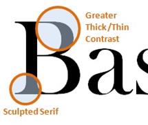 In the second half of the 18th century, some designers tired of the Rococo style and instead sought inspiration from Classical art. This interest was inspired by recent archaeological finds, the popularity of travel in Greece, Italy, and Egypt, and the publication of information about Classical works. Neoclassical typographical designs used straight lines, rectilinear forms, and a restrained geometric ornamentation. John Baskerville, an English designer from the period, created book designs and typefaces that offered a transition between Rococo and Neoclassical. In his books he used superbly designed types printed on smooth paper without ornament or illustration, which resulted in designs of stately and restrained elegance. Baskerville's fonts had sharper serifs and more contrast between thick-and-thin strokes than Rococo typefaces, and his letters had a more vertical, geometric axis.

 In the late decades of the 18th and early decades of the 19th century, Giambattista Bodoni, the Italian printer at the Royal Press of the Duke of Parma, achieved Neoclassical ideals in his books and typefaces. Bodoni laid forth his design statement in Manuale tipografico (1788; УInventory of TypesФ); another edition of this book was published in 1818, after his death, by his widow and foreman. Bodoni advocated extraordinary pages for exceptional readers. He achieved a purity of form with sparse pages, generous margins and line-spacing, and severe geometric types; this functional purity avoided any distractions from the act of reading. He drew inspiration from Baskerville as he evolved his preferences from Rococo-derived designs toward modern typefaces.
 The Didot Family of French printers, publishers, and typefounders also achieved Neoclassical ideals in their work. Books designed by the Didots have minimal decoration, generous margins, and simple linear borders. Belonging to the third generation of the family, Firmin Didot had taken over his fatherТs printing house with his older brother Pierre in the revolutionary year of 1789. A few years later they moved into the rooms of the former Royal Palace in the Louvre, where they produced beautiful folio editions of the works of Vergil, Horace and Jean de La Fontaine. In the printing Pierre Didot utilized extra-condensed types designed at his brother Firmin's foundry named after the brothersТ father, François Ambroise. These provided a crisp counterpoint to the engraved illustrations by various artists working in the school of the French Neoclassical painter Jacques-Louis David. The idealized figures in ancient Roman environments in the editions were engraved with flawless technique, obsessive detail, and sharp contrasts of light and shadow. The DidotТs flawless neo-classical Roman font soon became predominant across the whole of Europe.
Illustrations: 1. Baskerville (Transitional Style) font, 2. & 3. Bodoni (Modern Style) font, 4. The extra-condensed François Ambroise types.
VOCABULARY NOTES
VERBS & COMBINATIONS WITH VERBS
1. to advocate smth ['ædvəkeɪt] Ц отстаивать что-л
2. to draw inspiration from smb ['drɔ: ˌɪnspɪ'reɪ∫(ə)n] Ц черпать своЄ вдохновение в ком-л
syn. to seek inspiration from smth ['si:k ˌɪnspɪ'reɪ∫(ə)n] Ц искать вдохновени€ в чЄм-л
3. to inspire smbТs interest [ɪn'spaɪə] Ц подогреть чей-л интерес
4. to lay forth oneТs statement ['leɪ 'fɔ:θ] Ц изложить свои мысли, высказатьс€
syn. to set forth oneТs statement, to expound oneТs statement, to state smth
6. to offer a transition between smth and smth else ['ɒfər◡ə træn'zɪ∫(ə)n] Ц выражать (€вл€ть собой) переход от чего-л к чему-л ещЄ
7. to provide a (crisp) counterpoint to smth [prə'vaɪd ə ('krɪsp) 'kaʊntəpɔɪnt] Ц (резко) контрастировать с чем-л
syn. to be in sharp contrast with smth
8. to result in smth [rɪ'zʌlt] Ц иметь (своим) результатом что-л
COMBINATIONS WITH ADJECTIVES
9. flawless technique ['flɔ:lɪs tək'nɪk] Ц безупречна€ техника (выполнени€)
10. generous margins ['dʒen(ə)rəs] Ц большие (букв. щедрые) пол€ (страницы)
11. obsessive detail [əb'sesɪv 'di:teɪl] Ц скрупулезна€ подробность (изображени€)
12. sparse page [spɑ:s] Ц страница с небольшим количеством напечатанного материала
ADVERBS
13. superbly [s(j)u:'pз:blɪ] (designed types) Ц великолепно, роскошно, богато (выполненный шрифт)
PROFESSIONAL TERMS
14. axis ['æksɪs] (pl axis ['æksi:s]) Ц ось
15. line-spacing ['laɪn ˌspeɪsɪŋ] Ц междустрочный интервал
16. rectilinear curvilinear [ˌrektɪ'lɪnɪə]Ц пр€молинейный
ant. v.s. UNIT VII: curvilinear Ц криволинейный
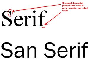 17. serif ['serɪf]Ц засечка, отсечка (на концах основных штрихов литеры), шрифт с засечками. Ўрифт без засечек называетс€ Уsans serifФ (от французского sans Ц УбезФ). »ногда шрифт без засечек называют УгротесковымФ или УготическимФ, шрифт с засечками Ц У романскимФ. v.i. UNIT IX
CULTUROLOGICAL & HISTORICAL TERMS
18. the Didots [dɪ'dɔ:z] Ц семейство ƒидо (семь€ французских типографов, издателей и книготорговцев 18 и 19 веков)
19. Firmin Didot [fə'men dɪ'dɔ:] Ц ‘ирмен ƒидо (1764 Ц 1836)
20. Pierre Didot ['pjer dɪ'dɔ:] Ц ѕьер ƒидо (1761 Ц 1853)
21. Giambattista Bodoni [ˌʒɑ:mbə'tɪstə bə'dɒnɪ] Ц ƒжамбаттиста Ѕодони( 1740 Ц 1813) Ц италь€нский типограф
22. Horace ['hɒnrəs] Ц √ораций (65 BC Ц 8 BC) Ц древнеримский поэт Узолотого векаФ римской литературы
23. Jacques-Louis David ['ʒɑ:k 'lwi: də'vɪd] Ц ∆ак Ћуи́ ƒави́д (1748 Ц 1825) Ц французский художник, основоположник французского неоклассицизма
24. John Baskerville ['dʒɒn 'bɑ:skəvɪl] Ц ƒжон Ѕаскервилл (1706 Ц 1775) Ц английский типограф и словолитчик
25. Jean de Lafontaine ['ʒɑ:ŋ də lə fən'ten] Ц ∆ан де Ћафонтен (1621 Ц 1695) Ц французский баснописец.
26. neoclassical [ˌni:əʊ'klæsɪk(ə)l] Ц неоклассический
i.e. относ€щийс€ к течени€м в искусстве второй половины XIX Ц XX вв., творческа€ практика которых основывалась на стилизации внешних форм искусства античности, эпохи ¬озрождени€ и классицизма.
27. Vergil ['vɜ:dʒəl] Ц ¬ергилий (70 BC Ц 19 BC) Ц знаменитый древнеримский поэт
II. VOCABULARY
ABBREVIATION USAGE
1. Parts of speech:
1.1. Notional words знаменательные (пон€тийные) слова:
a Ц adjective Ц прилагательное
adv Ц adverb Ц наречие
n Ц noun Ц существительное
num Ц numeral Ц числительное
v Ц verb Ц глагол
1.2. Structural / formal words служебные слова
prep Ц preposition Ц предлог
pron Ц pronoun Ц местоимение
cj Ц conjunction Ц союз
int Ц interjection Ц междометие
part Ц particle Ц частица
2. Linguistic terms
ant. Ц antonym Ц антоним
homo. Ц homonym Ц омоним
e.g. like¹ [laɪk] n (чьЄ либо) подобие, a похожий, prep как
like² [laɪk] v любить что-л
homoph. Ц homophone Ц омофон
e.g. sea¹ [si:] n море
see² [si:] v видеть
homogr. Ц homograph Ц омограф
e.g. bow¹ [bəʊ] n лук (оружие), смычок, бант
bow² [baʊ] n поклон, v клан€тьс€
pl Ц plural (number of the noun) Ц множественное (число существительного)
sg Ц singular (number of the noun) Ц единственное (число существительного)
syn. Ц synonym Ц синоним
3. Miscellaneous words & word combinations
N.B. Mind that the majority of the Latin words and phrases belong to the written variety of English; in the spoken variety they tend to be substituted by the corresponding English ones. The latter are given in the bold type.
A.D. Ц (Latin) Anno Domini (= English Уthe year of GodФ) Ц года √оспода (от рождества ’ристова, (нашей эры)
B.C. Ц Before Christ Ц до рождества ’ристова (до нашей эры)
cf. Ц (Latin) confer (= English УcompareФ) Ц сравните
e.g.Ц (Latin) exampli gratia (= English У for example Ф) Ц например
etc.Ц (Latin) et cetera (= English У and so on Ф) Ц и так далее
i.e. Ц (Latin) id est (= English У that is Ф) Ц то есть
N.B. Ц (Latin) nota bene (= English У good to remember Ф) Ц полезно запомнить
smb Ц somebody Ц кто-либо
smth Ц something Ц что-либо
viz. Ц (Latin) videlicet [vɪ'di:lɪset] (= English У namely Ф) Ц а именно, Е (перед перечислением)
vs Ц (Latin) versus (= English У against Ф) Ц против
v.i. Ц (Latin) vide infra (= English У see below Ф) смотри ниже
v.s. Ц (Latin) vide supra (= English У see above Ф) смотри выше
& (= English УandФ) Ц и (союз)
N.B.: In dictionaries the indefinite pronoun form У one's Ф and the abbreviated У smb's Ф are used conventionally, whereas in actual speech they are substituted by the situationally required words: У one's Ф by a possessive pronoun; У smb's Ф by a possessive pronoun or a noun in the possessive case.
The difference between them is as follows:
1. У one's Фis a conventional sign for a possessive pronoun modifying something (or somebody) belonging to the doer of the action. In speech У one'sФ isrealized as a corresponding possessive pronoun (i.e., one in agreement with the subject).
The dictionary entry Уto try one's hand at teachingФ may be realized in actual speech as:
I tried my hand at teaching.
He tried his hand at teaching.
She tried her hand at teaching.
We tried our hands at teaching.
You tried your hand(s) at teaching.
They tried their hands at teaching.
2. У smb's Ф is conventional sign for a possessive pronoun or a noun in the possessive case modifying something or somebody belonging to some second or third person(s) Ц not the doer of the action.
The dictionary entry Уto borrow У smb's Ф moneyФ may be realized in actual speech as:
I borrowed his money. I borrowed John's money.
I borrowed her money. I borrowed my sister's money.
I borrowed your money.
I borrowed their money.

