


WHEN AND WHY TO USE MULTIMEDIA PRESENTATIONS (PowerPointЃ)
Though PowerPoint is everywhere these days, it doesn't have to be Ч and in many cases, it just plain shouldn't be. People use computer-based presentations too often as a crutch Ч they don't want to put in the effort to really know their presentation, and instead lean on the slides, basically just reading them to the audience. This is a really fast way to lose all of your charisma as a speaker! So, to decide when and why to use PowerPoint, consider the following:
Concepts Ч Ideally, a multimedia presentation is good to display information that would be difficult to merely verbalize. This includes visual information like structures, trends over time, photographic examples, diagrams of processes or models, etc. These things absolutely justify the use of some kind of visual aid. For example, explaining how a rotary engine works would be next to impossible without some kind of visual aid Ч ideally, an animation!
Bring the Audience Closer Ч When applicable, it is great to let an audience more fully appreciate a topic by bringing it closer to them. This means showing photos, playing sounds or videos. This is especially important in vacation or venue presentations, where judgments or opinions will be based on as close an experience as possible to actually being there.
Major Points Ч If you are determined to have text slides in PowerPoint, make sure it is only to reinforce your major points. Do not just list every single thing you are going to say as a bullet point Ч that's a LOT of text, it's very distracting, and it'll make your delivery turn to mush. Keep sharp, and don't depend on your slides as a crutch!
Business Precedent Ч Many multimedia presentations are meant to serve two purposes: they're an aid for the presentation, but also a replacement or reminder of the presentation for anyone who missed or forgot it. This is common in business! "Oh, I couldn't make it to that meeting, but just forward me the slides." But if this is the case for your presentation, consider making the slides purely visual, and put the important spoken content in the "notes" section. They won't actually appear on the slide, but they will be printed out with the slides (as long as you have them set to do that).
"B" and "W" Keys Ч It is possible (in fact, likely) that not ALL of your speech will be a good match for a PowerPoint presentation. That's normal! Just make sure not to try to use slides for parts of your speech that aren't right for them. Instead, turn the PowerPoint presentation off Ч and it's easier than you might think. The ¬ key turns the screen black; the W key turns the screen white. Use whichever is most appropriate for your venue, when you don't need anything onscreen. Software programs, such as MS PowerPointЃ, offer a lot of style templates to start out with Ч and the sheer number of styles can be intimidating! However, not all styles are created equal. There are some good rules of thumb to use when picking or creating a style, to keep the audience happy, visually pleased, and not confused. Here they are:
|
|
|
Colours Ч When choosing colours in PowerPoint slides, the key is CONTRAST. Whether it is a dark or a light background, make it very clearly dark or light Ч and make the text clearly opposite in color. Some colors can be tricky Ч if you want red, do not use pure red, but instead a darker or lighter red, depending on the situation. Studies show that the most popular PowerPoint style is a dark blue background with light yellow text, by the way. A good way to use colors tastefully is to LIMIT the number of colors involved. Sure, use a different color for emphasis, for example Ч but only ONE different color. Once your slide looks like a rainbow, it may look foolish!
Text Ч There should never be too much text on a PowerPoint slide, but let us make sure that whatever text there is, it looks good. Other than the contrast mentioned above, make the text large enough to see (at least 24-point) and a legible font (non-serif fonts like Arial or Verdana tend to read best). Finally, 6x6 rule. That is, have NO MORE than 6 lines of text on a slide, and NO MORE than 6 words per line.
Standardize Ч Whatever style you choose, make sure it stays the same across all the slides! Consistent titling, coloring, fonts, capitalization, logos in the corners, etc. You'd be surprised how much this rule is violated. To help, try exploring the "master slide" feature in PowerPoint Ч it can automatically standardize any style changes across all slides. It is very useful!
Navigation Ч It can help your audience to "know where they are" in your speech; so, when moving from one section to another, go back to a "map" of the speech, and update them on where they are. The slide below,.
After you've determined that you should use PowerPoint for your presentation and chosen a Style for your slides, here are some pointers for effective slide content:
What CanТt Be Said Ч PowerPoint is best for things that are difficult to communicate verbally. This includes processes, concepts, mechanisms, structures, hierarchies, photographs, any kinds of graphs... Otherwise, communicating things would be longer and more difficult to merely verbalize...
Bring the Audience Closer Ч When applicable, it's great to let an audience more fully appreciate a topic by bringing it closer to them. This means showing photos, playing sounds or videos. This is especially important for vacation or venue presentations, where judgments or opinions will be based on as close an experience as possible to actually being there.
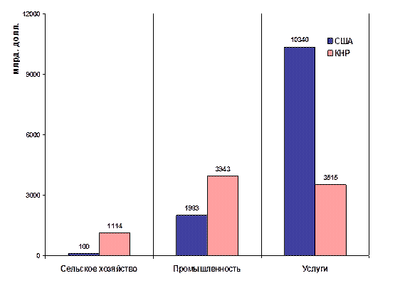
Things NOT To Do Ч There are a LOT of things that PowerPoint can do, but that should really never be done. Clip Art function is perhaps the most abused Ч cute little clipart really does nothing for your speech. In fact, it can severely distract the audience and undermine your credibility Ч and it almost NEVER adds any value to the speech. Don't use it. Other things to avoid: sounds, annoying transitions, animations (unless they're illustrating something useful), endless lists of bullet points, and charts of raw data Ч unless they have information specifically "called out" on them, as shown below.

